Your podcast discovery platform
Curious minds select the most fascinating podcasts from around the world. Discover hand-piqd audio recommendations on your favorite topics.

piqer for: Climate and Environment Global finds Globalization and politics
I'm a freelance journalist, currently based in Madrid. I used to be a News Producer at CNBC in London before, but I thought a little bit more sun might do me good. Now I write for several news organizations, covering a range of topics, from Spanish politics and human rights for Deutsche Welle to climate change for La Marea.
Infographics: A Map Of Past And Future Warming (In Your Hometown)
On October 8, the IPCC will publish its much-awaited special report on the impacts of global warming of 1.5ºC above pre-industrial levels. That's the magic number that will supposedly keep the worst consequences of climate change at bay. More importantly, avoiding the 1.5ºC threshold would stop feedback loops from kicking off, keeping climate change under (precarious) control. But I'm getting ahead of myself. We'll know all that from the best sources in a few days.
One-and-a-half degrees Celsius is an average. The Earth doesn't warm up homogeneously. The Arctic, for instance, warms much faster than the rest of the world, as the bright white, light-reflecting ice melts, revealing the dark, light-absorbing ocean below. On the other hand, ocean and wind dynamics keep the central-northern Atlantic cool.
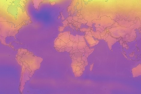
But how much has the world warmed up in your hometown? Well, here's the answer. Rosamund Pearce, the visualization wiz at Carbon Brief (whose maps I've recommended in the past) brings another master class in data journalism, supported by in-house analyst Zeke Hausfather.
The world map that dominates the piece is broken up into a grid of cells, each of which is roughly 100km wide. And each cell has a color, representing the historical warming of that grid from 1850 to this day... and beyond. You can see the projected warming for each cell, in each of the four scenarios used by the IPCC. Click the "Warming" tab on the bottom left to select one of the four. Their meaning is neatly explained in the text that follows the map.
But the fun doesn't stop there. You can click a cell to find out how much that part of the world has warmed since 1850 to this day, and how much it will warm for each of the four scenarios.
So my hometown in Southwestern Spain is already 1.4ºC warmer than in 1850, and it could go up to 5.1ºC by the end of the century if we don't cut emissions.
How about yours?
Note: Use as large a screen as possible to get the best out of this infographic.
looks like the açores will be a pleasant place (it already is).