Your podcast discovery platform
Curious minds select the most fascinating podcasts from around the world. Discover hand-piqd audio recommendations on your favorite topics.

piqer for: Climate and Environment Global finds Globalization and politics
I'm a freelance journalist, currently based in Madrid. I used to be a News Producer at CNBC in London before, but I thought a little bit more sun might do me good. Now I write for several news organizations, covering a range of topics, from Spanish politics and human rights for Deutsche Welle to climate change for La Marea.
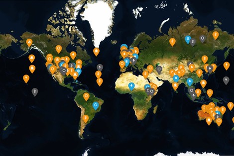
A Map Of Extreme Weather Attribution
Human made climate change will increase the likelihood and severity of extreme weather events. That's a fact. However, in a debate about climate change, I've always found it quite anecdotal to refer to a heat wave, a storm or a flood event. It's hard to keep the concepts global when you have to come down to local events. That's why I was pleasantly surprised this morning when this new tool popped up in my Twitter timeline.
It's basically a world map, but it doesn't only show where weather events have been happening. Instead, the authors (Roz Pidcock and Rosamund Pierce) have tried to map the human influence of these phenomena, pinpointing all the peer-reviewed articles that looked into causality of extreme weather. This field of climate science, known as extreme event attribution, is the best answer so far to link global processes and local events.
Just a quick look at the map reveals some interesting trends. For example, Australian extreme weather events are very well researched, and linked to human activity beyond reasonable doubt. Still, Australia (one of the world's major coal producers) is one of the countries with a largest proportion of climate deniers. That leads climate change journalists like me to another question: If feeling the heat is not enough to accept the facts, what is?
I've also noticed the very high concentration of studies in the developed world. That's a shortcoming of our research model, and the authors have done an excellent job at exposing it.
Finally, another reason to love this map is the chance to explore each and every event in detail. One can easily identify studies, experts, and even access the full list through a linked Google Sheet to sort and filter them as you need. In addition, the authors intend to keep the map up to date, so I really couldn't ask for more.
As if the map was not enough, a very good article comes with it, explaining their findings and methodology.
This is what journalism is all about.