Your podcast discovery platform
Curious minds select the most fascinating podcasts from around the world. Discover hand-piqd audio recommendations on your favorite topics.

piqer for: Global finds Technology and society
Prague-based media development worker from Poland with a journalistic background. Previously worked on digital issues in Brussels. Piqs about digital issues, digital rights, data protection, new trends in journalism and anything else that grabs my attention.
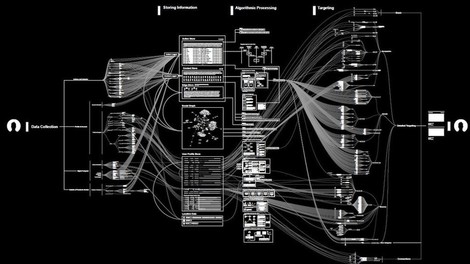
Facebook's Web Visualized
BBC takes a look at a fascinating research, which maps the mostly secretive operations of Facebook and untangles how the algorithms of the social media giant process our data.
"[The research] shows in cold and calculated terms how much we are giving away for the value of being able to communicate with your mates," says Dr Julia Powles, an expert in technology law and policy at Cornell Tech.
Vladan Joler is the man behind the fact-finding. Apart from being Associate Professor at the University of Novi Sad in Serbia, he’s also leading Share Lab, a research and data investigation organization that employs data mining and data visualization to showcase various aspects of data privacy.
Share Lab put its lens on Facebook and created gripping infographics that illustrate "the scale of Facebook's reach". Multiple complex maps present the intricate system behind social network's data collection engine and much more. One visualization presents how the information we provide online feeds Facebook's algorithm. Another flow chart shows web of connections of Mark Zuckerberg.
It's quite frustrating that the graphs in this BBC article are basically unreadable given their small size. For large-scale infographics, follow the references to the Share Lab website. Head there especially if you prefer graphics over text.