Your podcast discovery platform
Curious minds select the most fascinating podcasts from around the world. Discover hand-piqd audio recommendations on your favorite topics.

piqer for: Climate and Environment Global finds Globalization and politics
I'm a freelance journalist, currently based in Madrid. I used to be a News Producer at CNBC in London before, but I thought a little bit more sun might do me good. Now I write for several news organizations, covering a range of topics, from Spanish politics and human rights for Deutsche Welle to climate change for La Marea.
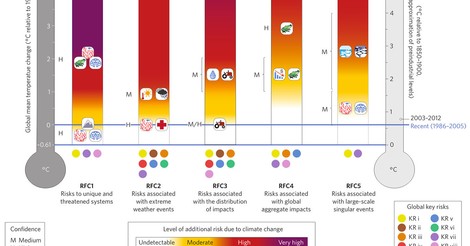
The Only Climate Risk Graph You Need – Explained
Climate change poses many risks, some to humans, others to other species. It means danger for the environment, the economy, society and even for culture. Many of these risks are interconnected and can boost each other. For example, if the Greenland icecap melts, North Atlantic fisheries would be disrupted, at the same time that Inuit culture would disappear, sea level rise would drown coastal cities and low lying islands and Arctic ecosystems would be damaged.
Here you have all (or at least, most) of the threats from global warming, contained in one graph. Published by the International Panel on Climate Change (the experts advising the UN on these matters), it was reviewed last year by a group of scientists, who found it accurate. Also, it's terrifying.
In this article for Vox, David Roberts dissects the famous "Burning Embers" graph, allegedly the only one you need to discern and understand the dangers of an increasingly warm planet. The graph divides the risks in the following groups:
- To unique and threatened systems
- Associated with extreme weather events
- Associated with the distribution of impacts
- Associated with global aggregate impacts
- Associated with large-scale singular events
These are set over a timeline that explains when they'll kick in, their level of severity and what degree of confidence scientists have for each individual risk.
It's even better when it's explained. This article is a great tool, for example, to understand the importance of avoiding a warming of 2ºC over preindustrial levels (and the absolute disaster that would be crossing the 3ºC threshold). Vox does a great job, again, in simplifying complex ideas and concepts.
We are already in danger, there’s more danger to come, and the best we can hope for is to slow and stop the process before the dangers are catastrophic. That’s the shape of things.
thanks for this piq! to me, neither the text nor the infografics seem really helpful. probably one would need someone like hans rosling to make the data vibrate in a meaningful way.